This tutorial is for more advanced mappers. I originally posted it on FPS Banana here:
http://www.fpsbanana.com/tuts/5149
Neway, here goes:
This is a more in-depth guide to hinting than the other hint brush tutorial found on FPS Banana. I'm putting this up because I'm really pissed at seeing good maps with bad fps because hints were not used properly.
Before you read this tutorial, I expect you to understand the basic concept of hint brushes and vis leaves and how they work. This tutorial may help:
http://www.fpsbanana.com/tuts/3533
This tutorial is just to show you some examples of when they should be used.
Okay, to begin...
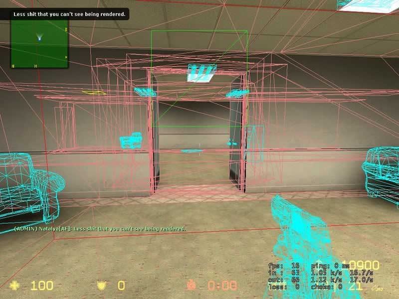
Please look at Screens 1 and 2. This is an example of where hints belong but were not used. As you can see, in screen 1 you're looking at a wall next to a corner. Well in screen 2 you see the wire-frame version... The player is rendering stuff directly behind the wall, around the corner, AND around another corner which can't even be seen from here...
SS1:
SS2:
This means that a player's computer is working harder to render stuff that they can't even see, and causes lag and low fps. Now my computer is god so u see I got tons of fps anyway, but still... I'd have like 300 if this was done properly. This is the kind of thing that makes me want to beat my head against a wall.
So, how do we avoid this unfortunate occurrence? Hint brushes. You need to put hint brushes around corners in your map diagonally. There was an example in the linked tutorial. Okay then, which corners should get this treatment?
Preferably all of them. D: Now some are just too ridiculously large to do it, but whatever... Take a look at screen shot 3. It's a newer version I'm working on of af_omega which is a bomb map I made a few months ago before I understood hint brushes. As you can see I put hints at almost every corner. I'm not quite done with them though so don't think that's all you need.
SS3:
Also, take note of the weird hint brushes in the courtyard going up. What those are doing is keeping players near the wall from rendering stuff on the top floor that they can't actually see. That might seem a little excessive, but when I don't have hammer hiding props and func_details, you'd see that next to those windows are computers and file cabinets and stuff... It's actually rather cluttered, so this helps players out some by making them not render those poly-heavy models if they get up close.
Screen 4 shows what it looks like without the hint brushes. We're in a position where we shouldn't be able to see anything inside, yet we render most of the top floor. With properly placed hint brushes like in screen 3, it reduces this to just the ceiling light models you see close to the window. You don't render the computers and chairs and stuff.
SS4:
Screen 5 shows how it works in hammer. The edge of the hint brush with the hint texture runs at a 45-degree angle with the bottom of the window sill and ends at the top in the ceiling. The bottom of the hint brush (not shown) runs into the ground outside. What this brush does is keeps a player standing underneath the hint brush from rendering stuff inside the building beyond the brush's hint side. It also keeps players inside on the second floor there from rendering stuff below the brush on the ground outside.
SS5:
NOTE:
Hint brushes don't need to be at 45° to the corners they're going around, but it's easier to work with 45° angles because you can easily make the hint brush's face touch the exact corner of the wall brush it's going around.
Screen 6 shows what's rendered by a player standing on the ground near the window with the hint brushes in place... Just the ceiling lights. The player neither sees nor renders anything beyond, including the office computers. This is success.
SS6:
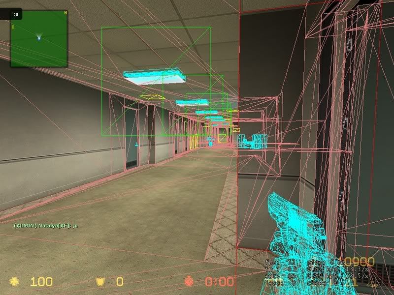
The same method should be done around as many corners in your map as possible... Like in halls and stuff. For example, here are pics of a modded version of cs_office that I optimized with hint brushes at the corners.
You can see that not much is rendered beyond the corners because I put hint brushes in the door frames. Put them everywhere you can think of.
There is one more thing I must mention though, and this is a warning to all mappers who want to use hints...
For players with poor computers... Getting like 40 fps or less especially, hints cause problems. They get a minor fps increase from the hint brushes putting less strain on their computers, but there is a downside. Players with poor comps will often not render other players coming around corners until its too late... That is their comp won't show other players until they're like already around a corner. This causes problems when the player you didn't render cuz your comp sucks is an opponent.It looks like they glitch around corners and can already be shooting at you if your computer is under par. So, with that in mind, take the advice in this tutorial ONLY if you're looking to create a map that is well optimized and meant for competitive play. If you expect the map to go onto a server with lots of people who have poor comps, they won't like the map because it will hurt their game play. The cs_office_unlimited_n2a map I showed right up there that I made... Well it was only on the server for a few months before it got taken down because the server is a n00b friendly server and had tons of people with crappy comps playing on it who didn't like how enemies would walk around corners and start shooting them before their computers could show the enemy. Just be warned about this side-effect.


 Reply With Quote

Bookmarks