If this is your first visit, be sure to
check out the FAQ by clicking the
link above. You may have to register
before you can post: click the register link above to proceed. To start viewing messages,
select the forum that you want to visit from the selection below.
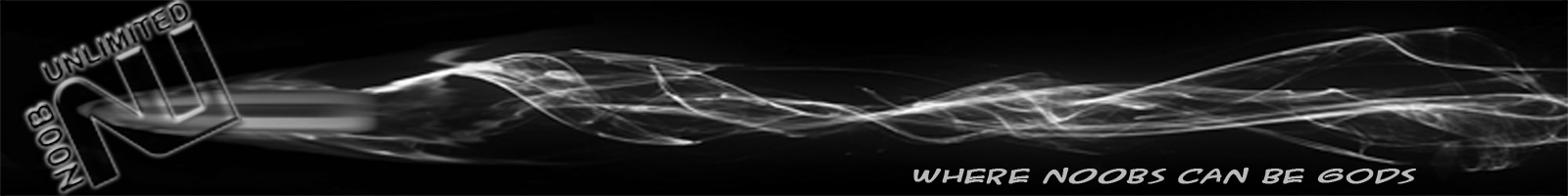
Overall it is a nice banner (a lot better than what I can perform with PS).
Some suggestions I would give you for a better banner is:
- Add a different font to the "Where noobs can be gods" to fit the NU logo
- Maybe add an abstract background rather than just black
- And maybe add something CS:S related into the banner
These are just my ideas on the banner. If your looking for simple and easy to manage, then I am sure that will work just fine. As always this is just my opinion, so lets not try to kill it too much lol
I like itt, maybe change the color of the N00B UNLIMITED thing to a different color..
oh and the Where n00bs can be gods part too, make it the same color as the n/u sign and such =] -if you change it lol
it blends waay too much =] or maybe its just that i like colorfullness...idk lol
[IMG]http://i750.photobucket.com/albums/xx144/nessav214/Onehit-1-1.jpg[/IMG]
effshowٿ: you backstabber!
onehit420: backstabber?
effshowٿ: you started the orgie without me!
[url=http://www.gameservers.com/?ref=1642968][img]http://images.gameservers.com/image_13.gif[/img][/url]
[CENTER][FONT=Fixedsys][CENTER][SIZE=4][COLOR=Red][FONT=System][B]I reject your reality and substitute with my own.[/B][/FONT]
[/COLOR][/SIZE][/CENTER]
[/FONT]
[IMG]http://i47.tinypic.com/2i71q2x.jpg[/IMG]
[/CENTER]
Your on the right track.
I like the color. It looks alot better
[IMG]http://i750.photobucket.com/albums/xx144/nessav214/Onehit-1-1.jpg[/IMG]
effshowٿ: you backstabber!
onehit420: backstabber?
effshowٿ: you started the orgie without me!
[url=http://www.gameservers.com/?ref=1642968][img]http://images.gameservers.com/image_13.gif[/img][/url]
now if you could add some bullet holes around the banner and some in the nu it would look better but thats my option....
[COLOR="Magenta"]6:32 PM - V A N E S S A: umm i have to go to the store in alittle when i come back i'll go on
6:32 PM - V A N E S S A: since i misss YOHHHH SOOO MUCHH![/COLOR]
<a href="http://www.tsviewer.com/index.php?page=ts_viewer&ID=917743" target="_blank"><img src="http://www.tsviewer.com/promotion/dynamic_sig/sig.php/clan_css/917743.png" alt="n00bunlimited TeamSpeak Viewer" title="n00bunlimited TeamSpeak Viewer" border="0" /></a>
IMO bullet thing isn't too great. I'd like to see something much more clean. I'd say original version of DoT's logo with the text background, but logo at left end and the text background just fades to black on the right. When it is totally faded or almost done, do the "Where N00bs Can Be G0ds" and it'll look nice. But that's just my style btw. I prefer clean, smooth graphics.
[img]http://unix.org.au/~brett/gif/waldioaw1.gif[/img]
[color=royalblue][b]Forum and Server Administrator[/b][/color]
PasTieZ: I am scared now thanks nat
natalyaaf: D:
PasTieZ: sio is going to ass rape me
NatalyaAF ウラヌス: i am the baninator :D
word jackd ת/ύ: ha the baninator and the pwninator
well Boss seeing how your color blind and nobody mentioned this....when selecting your colors in PS use the color match tool to make your "where noobs can be gods" text the same color red as the NY symbol they are 2 different shades of red ..makes it look a bit off.
when i say the color match tool i mean the little eye drop tool that comes up when you open your color chooser then put it on you NU red and boom...other than that dude it looks good.

 Tweet
Tweet


Comment